My Blog List

Showing posts with label Ancillary. Show all posts

Saturday, 16 April 2011

How effective is the combination of your product and ancillary texts?

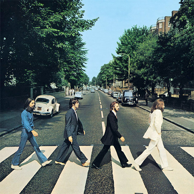
For both the front cover of my digipak and my magazine advert I used the same image. It was an image taken from the video itself; so they all linked in together. It wasn't as though one had nothing to do with the other. I chose to do this for that reason as much of the time the promotion products do not link with the music video. Conventionally they use pictures of the artist or an image of something entirely different e.g. The Beatles - Abbey Road, Nirvana - Nevermind; both of these albums follow this convention. I choose to use an image from the video as it made them more of a package that all come together, and partly to step away from the usual forms and conventions of what they should be.

I still decided to use the digipak and magazine advert as the same image because the advert is there to get people to buy the album and if they see the image in the magazine they are more likely to either pick it up because they recognise the image, or it would be less trouble for them to find as they would be able to just pick it out off the shelf due to recognition.  


From the digi-pak, as there is just one girl featured on it and she is always alone, people can see that this is probably what it is about and together with the hearts they can infer it is about a break up of a relationship. So this is effective when put together with the video. The only colour really bright on it is the red of the balloon which makes it stand out more also showing the theme. The checkerboard image behind the track listing, is like a snapshot summary of the music video so is very well linked to the video.


The magazine advert looks very similar to the digi-pak with the same image on the front. They 3 pieces all draw in nicely together to make each more effective with the help of the other. The font used is quite simple and plain, but also at the same time bold. This is quite like the video itself, as even though it is not what people would call 'eventful' it still puts a strong message across.

I think that the commbination of the ancillary tasks and the product is very effective. They fit in well all together and are easily recognised as one whole package. With the advery doingwhat is spposed to do - advertise the products as they can be easily recognised from it.

Friday, 4 March 2011

Digipak


I chose to use different images from the video mainly for the digipak, instead of just taking random pictures of my actor and using them; I think that this makes it link more to the video. All are different and mostly simple with not much going on; I did this so that it did not look too busy as I had the checkerboard collage for the back cover.

Magazine Advert


I used the same image from the front of my digipak as I did for the magazine advert, I think this is reasonable as the same is done with a lot of artists such as the example I looked at with British Sea Power. I think this happens mainly due to the fact hat if someone sees the advert, when they go to the shop they can easily recognise what they are looking for rather than having to search for it which would make them less likely to buy it. 

Sunday, 27 February 2011

Magazine adverts

After looking at different CD advertisments I have found that most keep it quite simple with the images not distracting from the text showing when it is on sale etc etc. They also resemble the front of the album cover perhaps so that it is easily recognisable from the origonal advert.

For example - British Sea Power's Valhalla Dancehall's LP advert is just the front cover of the album with some reviews at the bottom of the page and details of the sale.
Learning from this I think I may use the image from the front of my digipak of the shoes, chaging around the text making it slightly more eye-grabbing; and maybe add some comments about the song.
Album Cover
Magazine Advert

Thursday, 10 February 2011

Digipak Analysis

While creating my own digipak I thought it best to look back what other artists have used for their own; looking at my own CDs I discovered that not many artists use the cardboard case, usually opting for the jewel case. But I did find actually that two of my favourite albums used a digipak; MGMT - Ocacular Spectacular and Arcade Fire - The Suburbs.
Both look asthetically different; with the MGMT album using images of the two frontmen on a bright cover to draw attention. While Arcade Fires members feature nowhere on the sleeve and drawings of cars and trees being the main focus of the front cover with only the bands name featuring in small text in the top right corner.

Arcade Fire Front Cover
The front cover of this album is very simple but the audience can tell that it fits in with the theme of the album 'Suburbs' you can see the family type car with a big white house and tree behind the fence. These things are all stereotypical things that you would find in the Suburbs. The fact that this picture looks to be hand drawn, makes it look even more different from what you usually see when looking at album covers. Usually they are photos of the artists themselves so that it is more recognisable. Especially as the name of the band is written quite small in the top corner. This shows how they want the album to be recognised due to the music not necessarily the name or the cover.


MGMT Front Cover
MGMTs cover is also quite simple but they follow more of the regular conventions; band members are featured on the front with just straight shots of them. The name of the album is not on the cover but in the centre is the name of the band; in a font that even though in plain colours is still eye-catching due to the fact is it different from what you would normally expect. I think that even though the two men are the main image and take up the majority of the cover space; you are still drawn to look at the background because of the different colours that make up the sky and the sea - you even notice the tiny details such as the moon in the background, even thought it would be tiny if you were looking from a distance.

Thursday, 27 January 2011

Photoshopping for digipak

For the front of my digipak I chose to use one of the images I took while I was out filming the balloon floating away scene for my video. When I opened the image on the computer I noticed that there were a few imperfections in the background that I felt removing would make the image better.


Origonal Image


Photoshopped image

I then decided that if I changed the image entirely to make it different from the rest it would add to digipak making it different. So I then used a different image from the day - and made it into pencil crayons affect.

Photoshopped image 2

I like this image as the background is faded slightly which draws more attention to the girl and especially the balloon