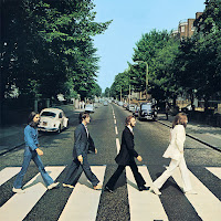
I still decided to use the digipak and magazine advert as the same image because the advert is there to get people to buy the album and if they see the image in the magazine they are more likely to either pick it up because they recognise the image, or it would be less trouble for them to find as they would be able to just pick it out off the shelf due to recognition.
From the digi-pak, as there is just one girl featured on it and she is always alone, people can see that this is probably what it is about and together with the hearts they can infer it is about a break up of a relationship. So this is effective when put together with the video. The only colour really bright on it is the red of the balloon which makes it stand out more also showing the theme. The checkerboard image behind the track listing, is like a snapshot summary of the music video so is very well linked to the video.
The magazine advert looks very similar to the digi-pak with the same image on the front. They 3 pieces all draw in nicely together to make each more effective with the help of the other. The font used is quite simple and plain, but also at the same time bold. This is quite like the video itself, as even though it is not what people would call 'eventful' it still puts a strong message across.
I think that the commbination of the ancillary tasks and the product is very effective. They fit in well all together and are easily recognised as one whole package. With the advery doingwhat is spposed to do - advertise the products as they can be easily recognised from it.


No comments:
Post a Comment