My Blog List

Tuesday 26 April 2011

How did you use media technologies in the construction and research, planning and evaluation stages?

How did you use media technologies in the construction and research, planning and evaluation stages?
(Radio Script)

Presenter: Hi again! I am now joined by Vicki, the dirctor of Crystal Castles and Robert Smiths new video 'Not in Love'. What sort of equipment did you use to actually film the video then?

Vicki: Well mainly I used an HD camera to film the video footage. The quality with this camera is very high; it made the video look more professional. Everything I wanted to stood out, for example, on the bridge the twigs were clearly shaped as a heart even though they were mixed in with lots of others.

Presenter: Yes exactly. I noticed at one point in the video that there seemed to be a heart just drawn in the darkness. Now how did you achieve that? I just can't work it out!

Vicki: Well that one took a lot of experimenting. I used a digital SLR camera to take an image. Putting it on a longer exposure; so the shutter stayed open for longer so the lens was exposed to more light so it could capture it all. It is a bit like film except all the frames are piled up on top of one another to make just one image. It took a lot of experimenting with different light sources and exposure lengths until I finally got it right. I used a phone light being moved in the shape a heart in front of the camera, instead of moving the camera on the tripod - which I did initially.


Presenter: Well it worked well, I must say. How did you bring it in all together then?

Vicki: Using Adobe Premiere Pro, I imported both my still images and the film footage to edit it all together. I used the programmes different features to develop it. The time/duration feature was a very useful tool. I was able to speed up/slow down differnt parts of the footage to help in fit to the song. This was a very important factor for me when creating the video as I wanted the songs stronger beats to be incorporated with what was being shown on screen and this enabled me to do so. The timeline along the bottom of the program was useful as it was incredibily easy just to drag and copy things along so I could get the repitition I wanted right. 

Presenter: And for your digipak, I noticed you used images that I recoginised from the video. What made you choose those?

Vicki: I used shots from my video, so that they were obviously linked and the theme ran through everything to bring them all together. I used Adobe Photoshop and InDesignto edit it things that may not have been noticable but would have been as an image on its own not moving. I was able to edit out the inperfections, such as people in the background and signage, using photoshop. Anything that would take the attention from what I wanted the audience to mainly look at. I was then able to import it into my finished indesign template. Another feature of photoshop that was very helpful in creating the finished product, was the effects you could create. I was able to take the photo of the girl with the balloon and make the background look handdrawn. I wanted the girl to stand out a lot more than the background and this effect enabled me to do so. It became fainter and left the balloon to be a lot bolder and one of the first things you noticed when looking at the image.

Presenter: Yes it definately was. Well thank you very much for your time today Vicki. I look forward to seeing your next video, hopefully in the near future!

Vicki: Thank you for having me on the show. I hope to be back again soon.

What have you learned from your audience feedback?

20110426 203926 by user5990959

Saturday 16 April 2011

How effective is the combination of your product and ancillary texts?

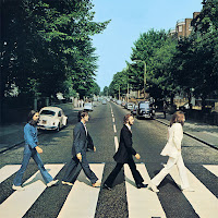
For both the front cover of my digipak and my magazine advert I used the same image. It was an image taken from the video itself; so they all linked in together. It wasn't as though one had nothing to do with the other. I chose to do this for that reason as much of the time the promotion products do not link with the music video. Conventionally they use pictures of the artist or an image of something entirely different e.g. The Beatles - Abbey Road, Nirvana - Nevermind; both of these albums follow this convention. I choose to use an image from the video as it made them more of a package that all come together, and partly to step away from the usual forms and conventions of what they should be.

I still decided to use the digipak and magazine advert as the same image because the advert is there to get people to buy the album and if they see the image in the magazine they are more likely to either pick it up because they recognise the image, or it would be less trouble for them to find as they would be able to just pick it out off the shelf due to recognition.  


From the digi-pak, as there is just one girl featured on it and she is always alone, people can see that this is probably what it is about and together with the hearts they can infer it is about a break up of a relationship. So this is effective when put together with the video. The only colour really bright on it is the red of the balloon which makes it stand out more also showing the theme. The checkerboard image behind the track listing, is like a snapshot summary of the music video so is very well linked to the video.


The magazine advert looks very similar to the digi-pak with the same image on the front. They 3 pieces all draw in nicely together to make each more effective with the help of the other. The font used is quite simple and plain, but also at the same time bold. This is quite like the video itself, as even though it is not what people would call 'eventful' it still puts a strong message across.

I think that the commbination of the ancillary tasks and the product is very effective. They fit in well all together and are easily recognised as one whole package. With the advery doingwhat is spposed to do - advertise the products as they can be easily recognised from it.

Directors Commentary

Monday 21 March 2011

Evaluation Analysis

Based on the analysis of your audience feedback, is there a consensus on how effective your work is? Do the replies pick out similar things to comment on? Do you accept the comments of your audience or would you want to challenge them?

Most of the replies I got from my audience evaluations showed a general consensus that the theme of the video and use of hearts was good, although some did not like that as much as others. Responses showed that the music fitted well with the images; but sometimes the camera work was shakey. I think that most of the comments I got were valid, as I have discovered that watching my work on a bigger screen multiplies the size of the camera shakes, compared to what I saw when working on the video on a much smaller scale. However some people had conflicting views e.g. one person said the video had a confusing narrative but it was still easy to interpret; which is then a contradicting statement.

Friday 4 March 2011

Digipak


I chose to use different images from the video mainly for the digipak, instead of just taking random pictures of my actor and using them; I think that this makes it link more to the video. All are different and mostly simple with not much going on; I did this so that it did not look too busy as I had the checkerboard collage for the back cover.

Magazine Advert


I used the same image from the front of my digipak as I did for the magazine advert, I think this is reasonable as the same is done with a lot of artists such as the example I looked at with British Sea Power. I think this happens mainly due to the fact hat if someone sees the advert, when they go to the shop they can easily recognise what they are looking for rather than having to search for it which would make them less likely to buy it.